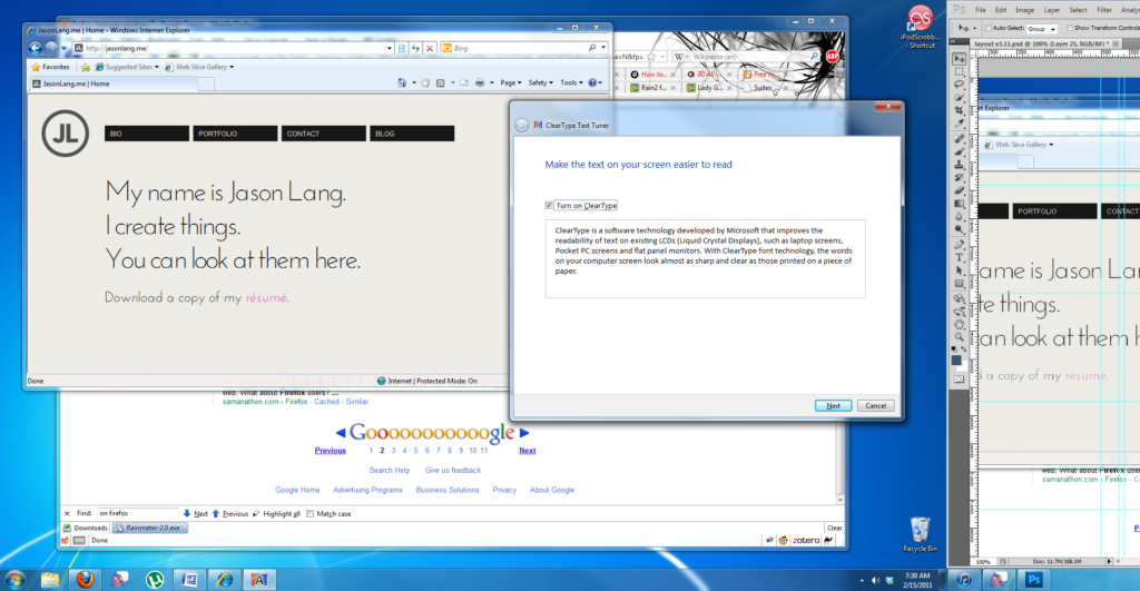
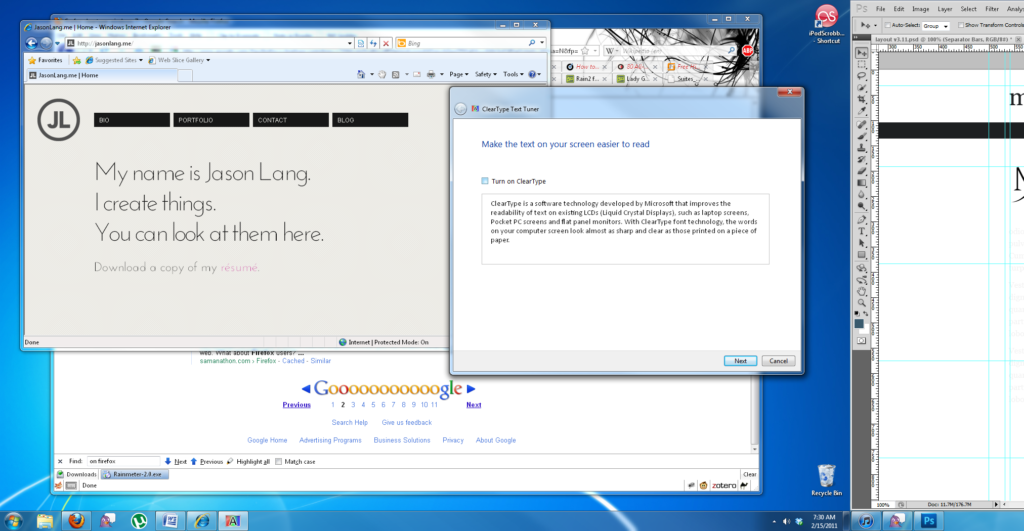
I would really like to be able to use the Google Fonts API on my website, but so far I haven’t seen very good results with how their fonts are rendered on Windows. I’ve been searching off and on for why this happens and have determined that at least on my system, the problem lies with ClearType on Windows 7 and not with any specific browser (the fonts even render poorly in Chrome). I’ve taken a couple screenshots of how Jason Lang’s website, which uses the Google Font API, looks with and without ClearType enabled.
Specific issues arise at the base of the letters, causing characters like the lowercase “g” to look rough or jagged. As soon as ClearType is turned off, the issue goes away. Unfortunately, turning ClearType off makes everything else on Windows look bad—see the menu text in Photoshop on the right side of the screenshot for an example. This is all appearing “out of the box” on Windows 7—I have not done any tweaking myself. It also isn’t specific to Jason’s website: the fonts appear the same way on Google’s example pages.
The information I’ve been able to find from searches is inconsistent, with a lot of people thinking that users just need to turn ClearType on to solve the problem. This may have been the issue for Windows XP, but not with Windows 7. Additionally, as far as I know there is no way to disable ClearType on a per-application basis either, so disabling it just for my browsers doesn’t appear to be a solution. Using the Google Font API seems to be a simple way to get additional fonts on a website, but when they display this poorly it ends up being more frustrating than anything else.


One response to “Type Frustrations”
[…] seems that one of the only solid solutions for ensuring that the Google Fonts display properly is, much to my friends‘ delight, to “get a Mac.” Will Moyer has one of the only […]